详解CSS中的伪元素::before和::after
当前位置:点晴教程→知识管理交流
→『 技术文档交流 』
本篇文章带大家了解一下CSS中的::before和::after伪元素,看看它们的应用,希望对大家有所帮助!
本文从最简单的开始,解释如何理解和使用::before和::after。然后再在实际使用场景中去应用它。 ::before和::after是什么?::before和::after可以添加到选择器以创建伪元素的关键字。伪元素被插入到与选择器匹配的元素内容之前或之后。
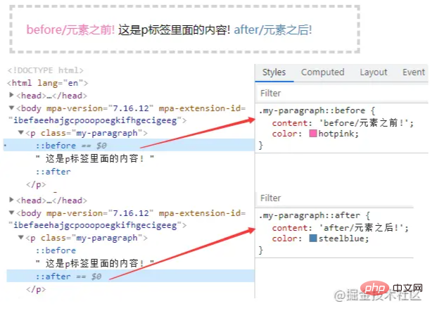
content属性 1)::before和::after下特有的content,用于在css渲染中向元素逻辑上的头部或尾部添加内容。 2)::before和::after必须配合content属性来使用,content用来定义插入的内容,content必须有值,至少是空 3)这些添加不会出现在DOM中,不会改变文档内容,不可复制,仅仅是在css渲染层加入。所以不要用:before或:after展示有实际意义的内容,尽量使用它们显示修饰性内容 content可取以下值: string 使用引号包一段字符串,将会向元素内容中添加字符串
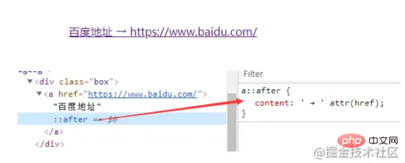
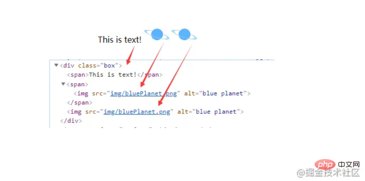
attr() 通过attr()调用当前元素的属性,比如将图片alt提示文字或者链接的href地址显示出来。
url()/uri() 用于引用媒体文件。比如:“百度”前面给出一张图片,后面给出href属性。
注意 1)URL不能使用引号。如果你将URL用引号括起来,那么它会变成一个字符串和插入文本“url(image.jpg)”作为其内容,插入的而不是图像本身。 2)content属性,直接使用图片,即使写width,height也无法改变图片大小; 解决方案:如果要解决这个问题,可以把content:''写成空,使用background:url()来添加图片
3)苹果端伪元素不生效,img、input和其他的单标签是没有:after和:before伪元素的(在部分浏览器中没有,如:苹果端会发现无效),因为单标签本身不能有子元素。 解决方案:给img包一个div可以解决 4)想要动态改变伪元素的图片,可以给当前元素添加伪元素图片的基础样式,再动态class来写伪元素的图片。 ::before和::after的应用配合quotes 属性使用
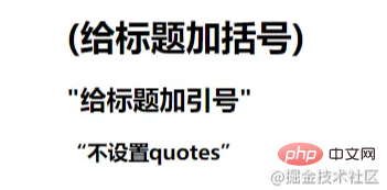
加括号
加引号
不指定,默认
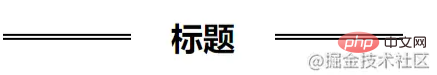
装饰标题
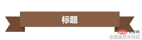
彩带标题
实现更逼真的阴影
替换内容 有些情况下content可以不使用::before或::after。如果content设置为单个图像,那么你可以直接在元素上使用它来替换该元素的 HTML 内容。 如页面上分别有以下三个内容:
加了replace类之后
清除浮动 方式一:
方式二:
模拟float:center的效果 float没有center这个取值,但是可以通过伪类来模拟实现。 原理:左右通过::before float各自留出一半图片的位置,再把图片绝对定位上去。
引用参考: Diving into the ::before and ::after Pseudo-Elements Faking ‘float: center’ with Pseudo Elements 该文章在 2023/7/7 10:27:24 编辑过 |
关键字查询
相关文章
正在查询... 


|


 400 186 1886